Brand identity guidelines
The brand identity guidelines is a set of standards for branding osu!-related projects. All use does not require approval.
Download the design kit here. The linked design kit contains some outdated assets. Also note that the included PDF is outdated and this page should be used instead.
osu!
The name of the game, osu!, must not be capitalised or italicised. The osu! official branding must not use any spaces:
- Game modes:
osu!,osu!catch,osu!taiko,osu!mania - Projects:
osu!academy,osu!talk - Services and applications:
osu!direct,osu!store,osu!stream,osu!tourney - Products and goods:
osu!keyboard,osu!supporter,osu!tablet
For all other terms, osu! must be treated as a qualifying noun, which means adding a space between osu! and the noun it modifies. Examples:
osu! tournamentsosu! communityosu! chatosu! clientosu! wiki
osu! cookie logo
Cookie usage restrictions
Single colour
 Single colour osu! logo
This is the single colour version of the osu! cookie logo. This version of the logo is very versatile and can be adapted to many design styles.
Please use the original file as the base, and do not create the logo from scratch.
Full colour
 Full colour osu! logo
This is the full colour version of the osu! cookie logo. The subtle drop shadow is part of the full colour logo.
Please use the logo as provided by the design kit without any modification.
Clear space area
 Example of margins around the osu! logo
Please give the cookie some breathing space. Use the "o" in "osu!" as the measurement of space.
Single colour cookie usage restrictions
Since osu! is community-driven, the osu! cookie logo is designed to be simple and versatile; it can adapt to many designs with ease. There is no strict colour restriction to the colour of the cookie.
 Valid modifications of the single colour osu! logo
- The cookie must be sharp at all times.
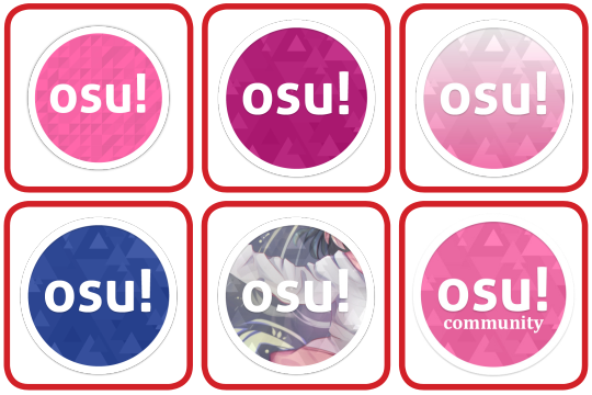
- You can use any colour for the cookie.
- You can add a linear gradient to the cookie. Radial gradients are not recommended as the ring and the middle element might appear in completely different colours.
- You may mask an artwork as a texture for the cookie; however, the cookie must maintain a good contrast with the background.
 Invalid modifications of the single colour osu! logo
- Do not change the cookie's aspect ratio.
- Do not rotate the cookie. The cookie must align to the medium's orientation or reader's eye when reading.
- Do not change any of the cookie's element into something else.
- Do not remove any of the cookie's element.
- Do not resize any of the cookie's element independently.
- Do not modify any of the cookie's element.
- Do not rearrange any of the cookie's element.
- The cookie must be tack sharp at all times. If it is part of an artwork, please place another sharp logo somewhere in the artwork.
- Do not apply any fancy or tacky effects on the cookie.
- Do not place any extra elements inside the cookie.
- Do not apply outlines to the cookie. Use a different cookie colour.
- Do not even think about changing the element. Come on. That is not even our logo. That is just some text in a circle.
Full colour cookie usage restrictions
Since osu! is community-driven, the osu! cookie logo is designed to be simple and versatile; it can adapt to many designs with ease. Please use the logo as it is, without any modification. All the restrictions applied on the single colour cookie applies to the full colour cookie too.
 Invalid modifications of the full colour osu! logo
- Do not use the old cookie.
- Do not use a different shade of pink.
- Do not add a gradient to the full colour cookie.
- Do not use other colours.
- Do not add anything into the cookie.
- Do not change any of the cookie's element into something else.